

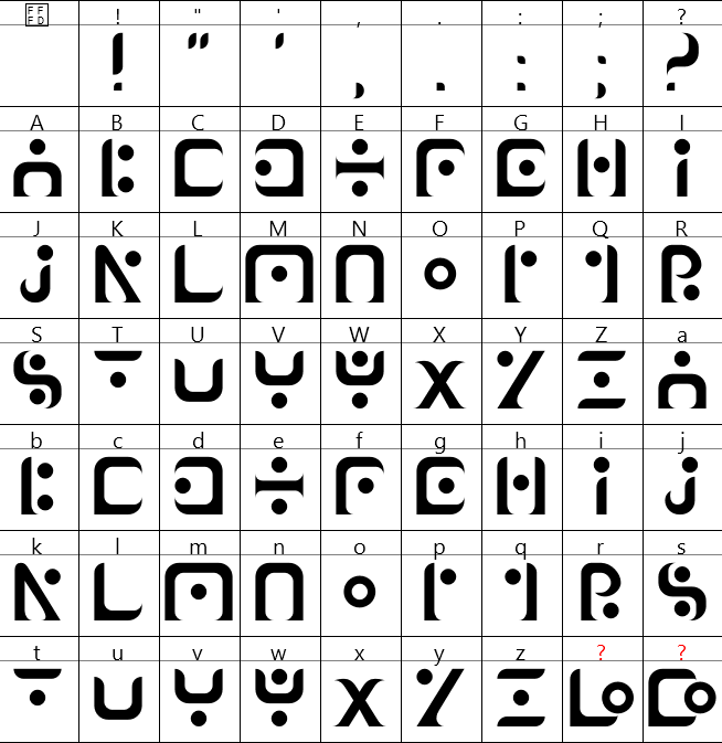
La police Naaron
LA POLICE NAARON

First font draft
It was written by my friend Finn, for a web comic they’re making called “Naaron” (check it out HERE).
The font is intended to mimic ancient runic languages, foreign and seamingly unreadable, while still being legible once you get used to it.
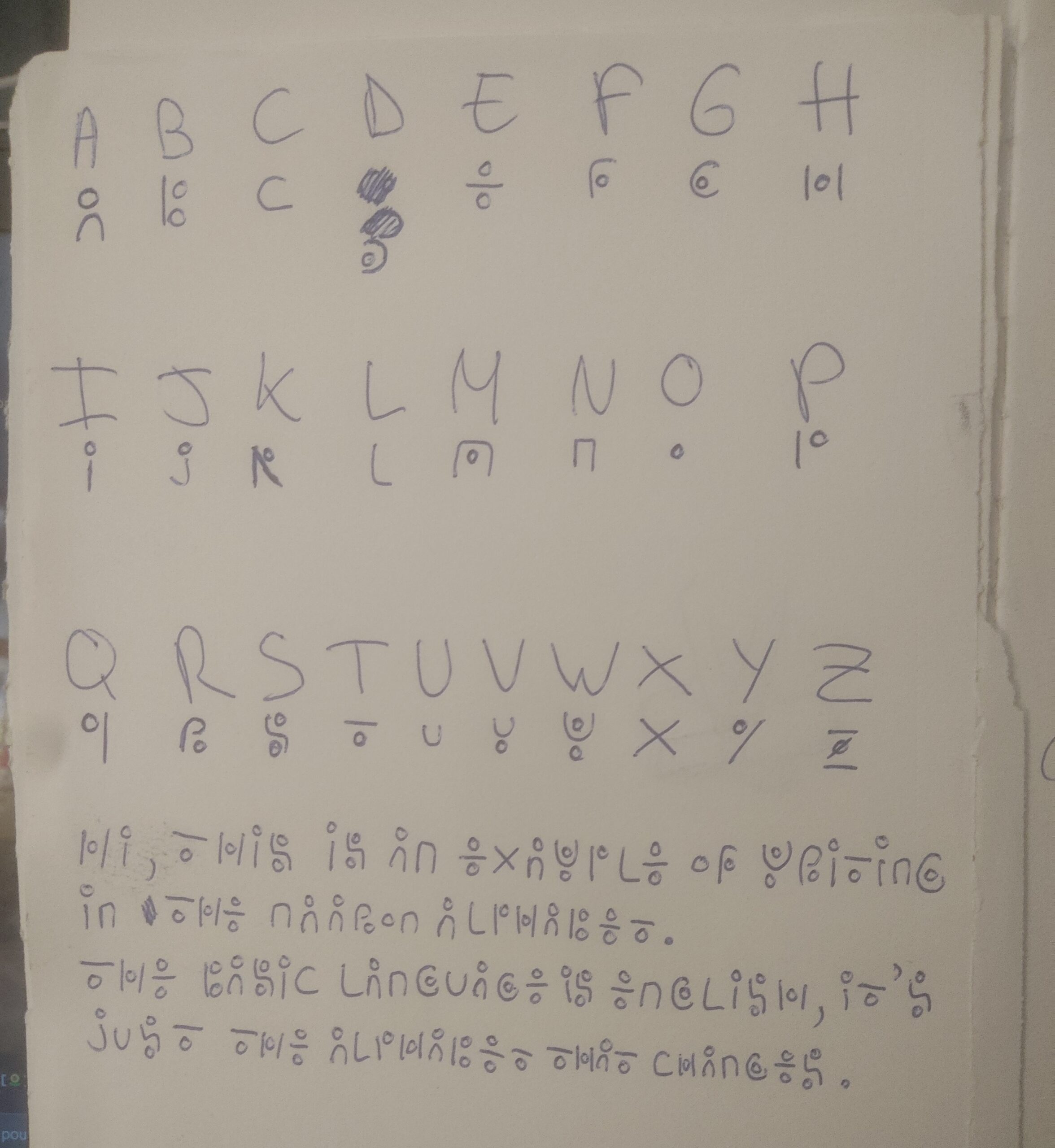
I wanted to see if i could make an entire font by myself with no knowledge of how to make one, and started with this piece of paper, as it has all the fundamental stuff i would need in order to make a font (ie : the alphabet).
starting with fontforge
It took me about 30 minutes of video watching and a couple of hours to get my head around how FontForge worked, which wouldn’t be possible without watching this fantastic video playlist (higly recommend !).
Créer une police de caractères s'est avéré plus facile que je ne le pensais, et aussi plus rapide ! Dessiner tout l'alphabet + quelques caractères de ponctuation EST la partie la plus longue, même si définir l'espacement entre chaque caractère sur l'axe Y et l'axe X était long, ça avait surtout l'air long parce que c'est ennuyeux, et dessiner ne l'est pas.
L'apprentissage de FontForge a été plus rapide ce que je croyait en voyant l'interface surchargée et archaïque, même si j'ai eu beaucoup de mal à comprendre le fonctionnement de certaines choses (ex : créer une nouvelle ligature, copier des caractères en MAJUSCULE dans leurs caractères en minuscule correspondant), c'était quand même relativement gérable.
getting started
Fortunately, there isn’t a million software used for font making, so i quickly settled on FontForge.
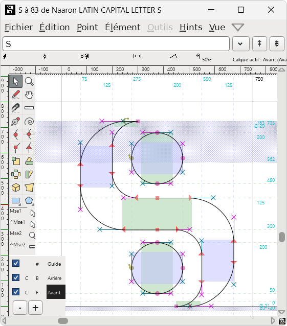
But before going into FontForge, i needed to draw each glyphs in Inkscape, so i drew the whole alphabet for 3 to 4 days based on a set of rules i made for the design of all the letters.
The rules were made in order to make the font look cohesive like “no outer edges can exceed the letter size” or “the inner radius will always be 150px and the outer radius 250px”.
wrapping up
The spacing of each characters was definitely the most time consuming part of the process and the least fun part of it, because you basically need to eyeball most of it based on how “alright” it feels to you.
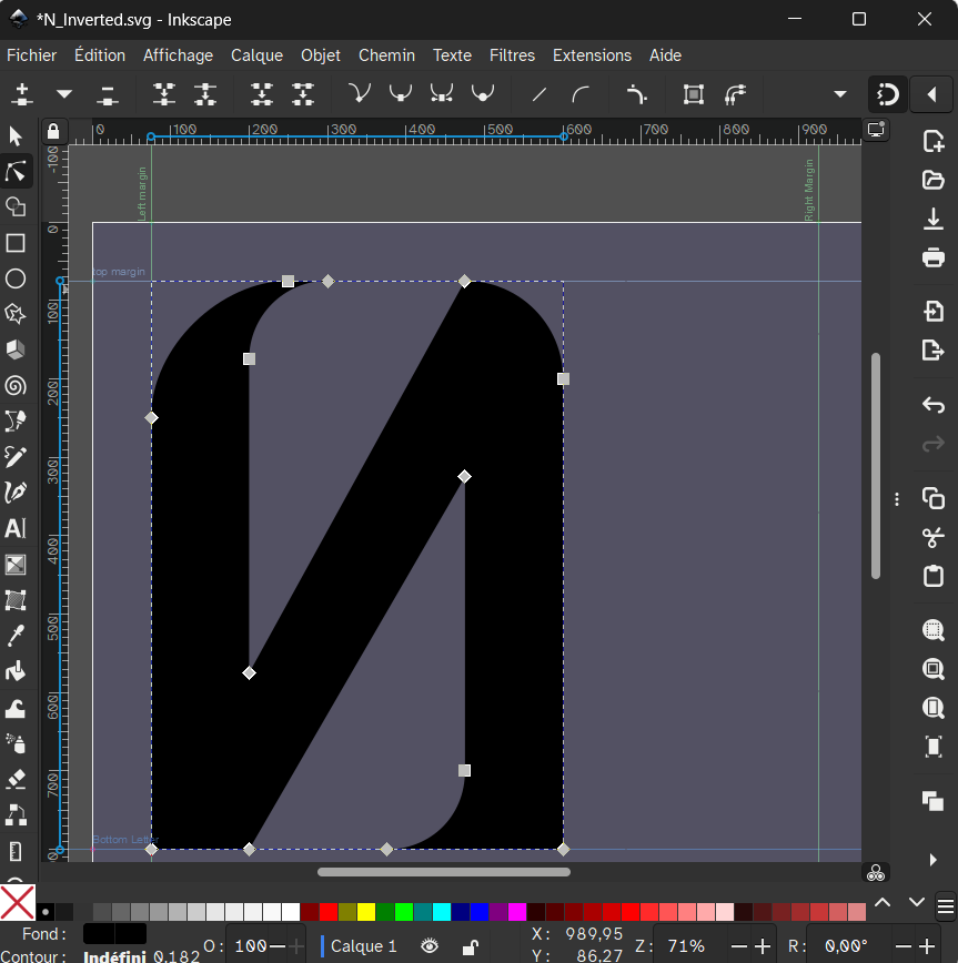
I also created some ligatures (combination of two letters into one for readability or style reason) for L and O, as well as C and O, because the O could perfectly sit on the pointy edge of the C and the L.
I went through a lot of redesign for each of the characters, for a lot of reasons (the inner radius was wrong, something was slightly off by a few pixels, etc.), i thought it was a pretty nice process and i had a lot of fun !
Créer une police de caractères s'est avéré plus facile que je ne le pensais, et aussi plus rapide ! Dessiner tout l'alphabet + quelques caractères de ponctuation EST la partie la plus longue, même si définir l'espacement entre chaque caractère sur l'axe Y et l'axe X était long, ça avait surtout l'air long parce que c'est ennuyeux, et dessiner ne l'est pas.
L'apprentissage de FontForge a été plus rapide ce que je croyait en voyant l'interface surchargée et archaïque, même si j'ai eu beaucoup de mal à comprendre le fonctionnement de certaines choses (ex : créer une nouvelle ligature, copier des caractères en MAJUSCULE dans leurs caractères en minuscule correspondant), c'était quand même relativement gérable.
First font draft
It was written by my friend Finn, for a web comic they’re making called “Naaron” (check it out HERE).
The font is intended to mimic ancient runic languages, foreign and seamingly unreadable, while still being legible once you get used to it.
I wanted to see if i could make an entire font by myself with no knowledge of how to make one, and started with this piece of paper, as it has all the fundamental stuff i would need in order to make a font (ie : the alphabet).
getting started
Fortunately, there isn’t a million software used for font making, so i quickly settled on FontForge.
But before going into FontForge, i needed to draw each glyphs in Inkscape, so i drew the whole alphabet for 3 to 4 days based on a set of rules i made for the design of all the letters.
The rules were made in order to make the font look cohesive like “no outer edges can exceed the letter size” or “the inner radius will always be 150px and the outer radius 250px”.
starting with fontforge
It took me about 30 minutes of video watching and a couple of hours to get my head around how FontForge worked, which wouldn’t be possible without watching this absolutely excellent youtube playlist about fontforge (higly recommend !).
wrapping up
I also created some ligatures (combination of two letters into one for readability or style reason) for L and O, as well as C and O, because the O could perfectly sit on the pointy edge of the C and the L.
I went through a lot of redesign for each of the characters, for a lot of reasons (the inner radius was wrong, something was slightly off by a few pixels, etc.), i thought it was a pretty nice process and i had a lot of fun !